
AIGA - DESIGN FUTURES RESEARCH
This project was a typographic task that involved redesigning an eleven-page AIGA briefing paper into an eight-page brochure. The brief focused on using editorial design and typography to give form to complex content, with clear rules: a fixed eight-page format (200 × 276 mm), a maximum of two typefaces from Dalton Maag, and no more than two colors. The goal was to create a readable, professional layout that communicates ideas clearly while reflecting the role of design in shaping content.
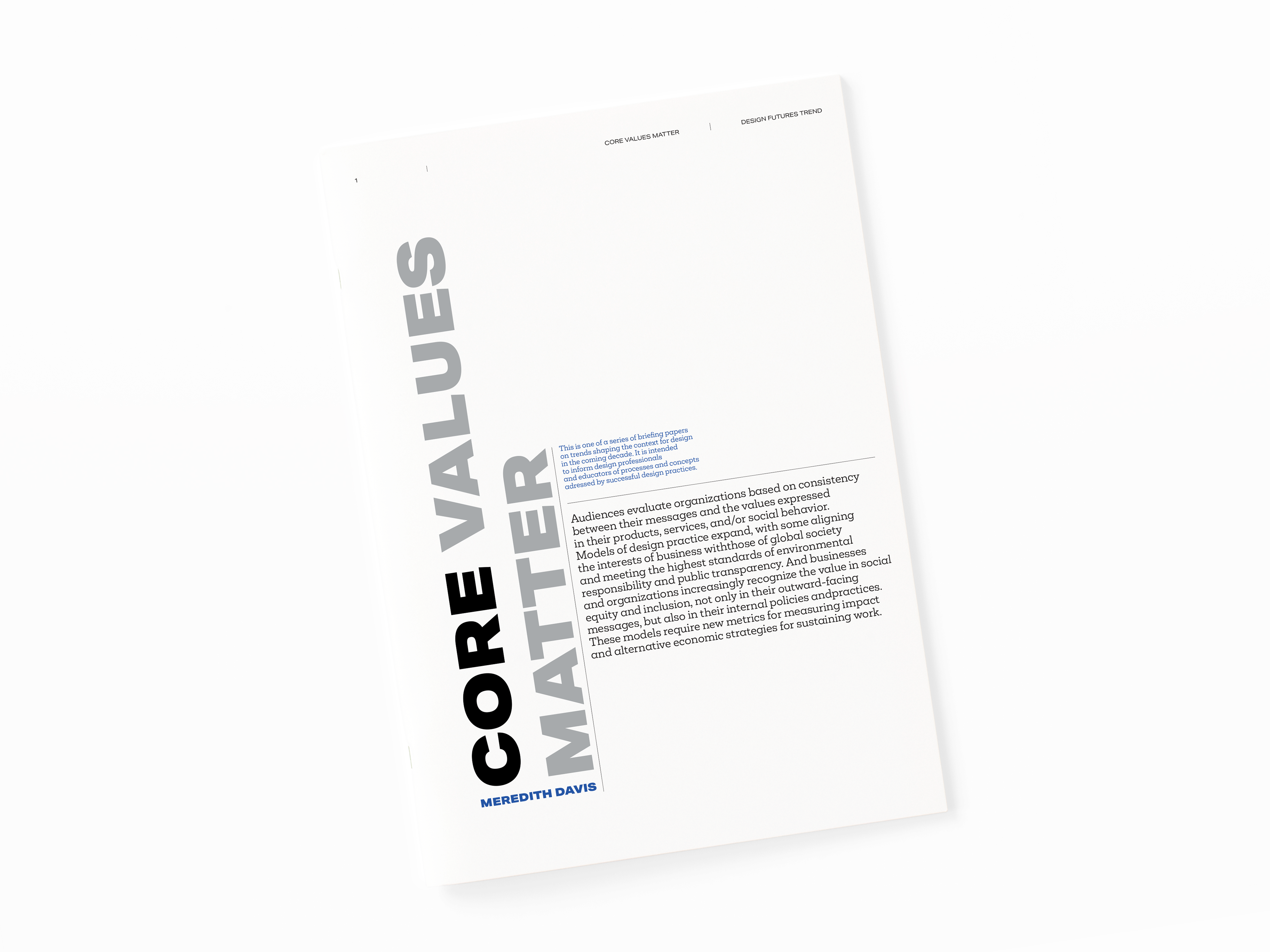
The final design of the magazine stands out for its readability and coherent, minimalist graphic design. The three-column layout of pages, used in most spreads, ensures a clear division of content and facilitates navigation. The thoughtful use of one accent color, visible in headings and highlights, strengthens the visual identification. The use of a sans serif font and appropriate proportions between font size and line spacing increase the comfort of reading and give the publication a contemporary character.
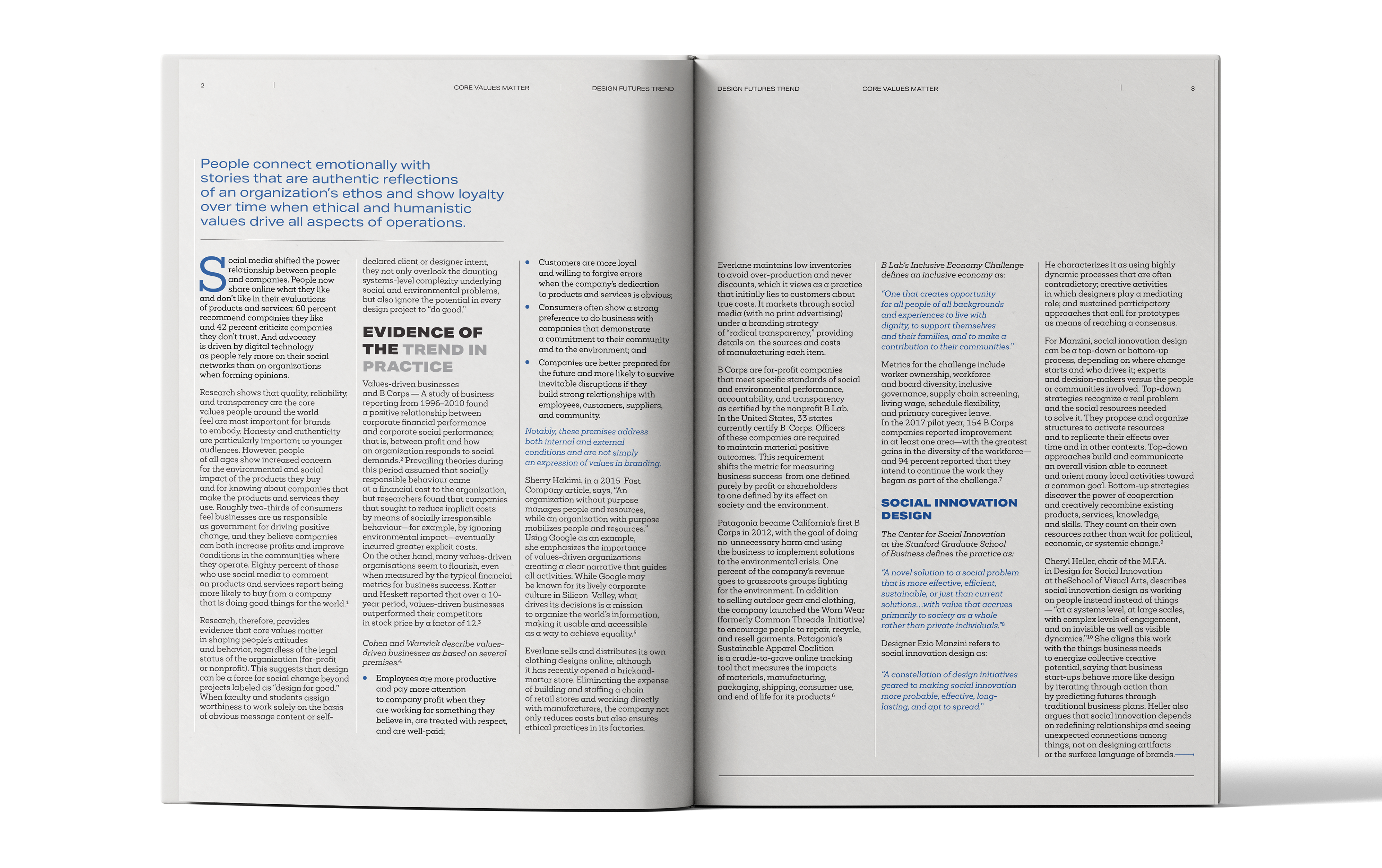
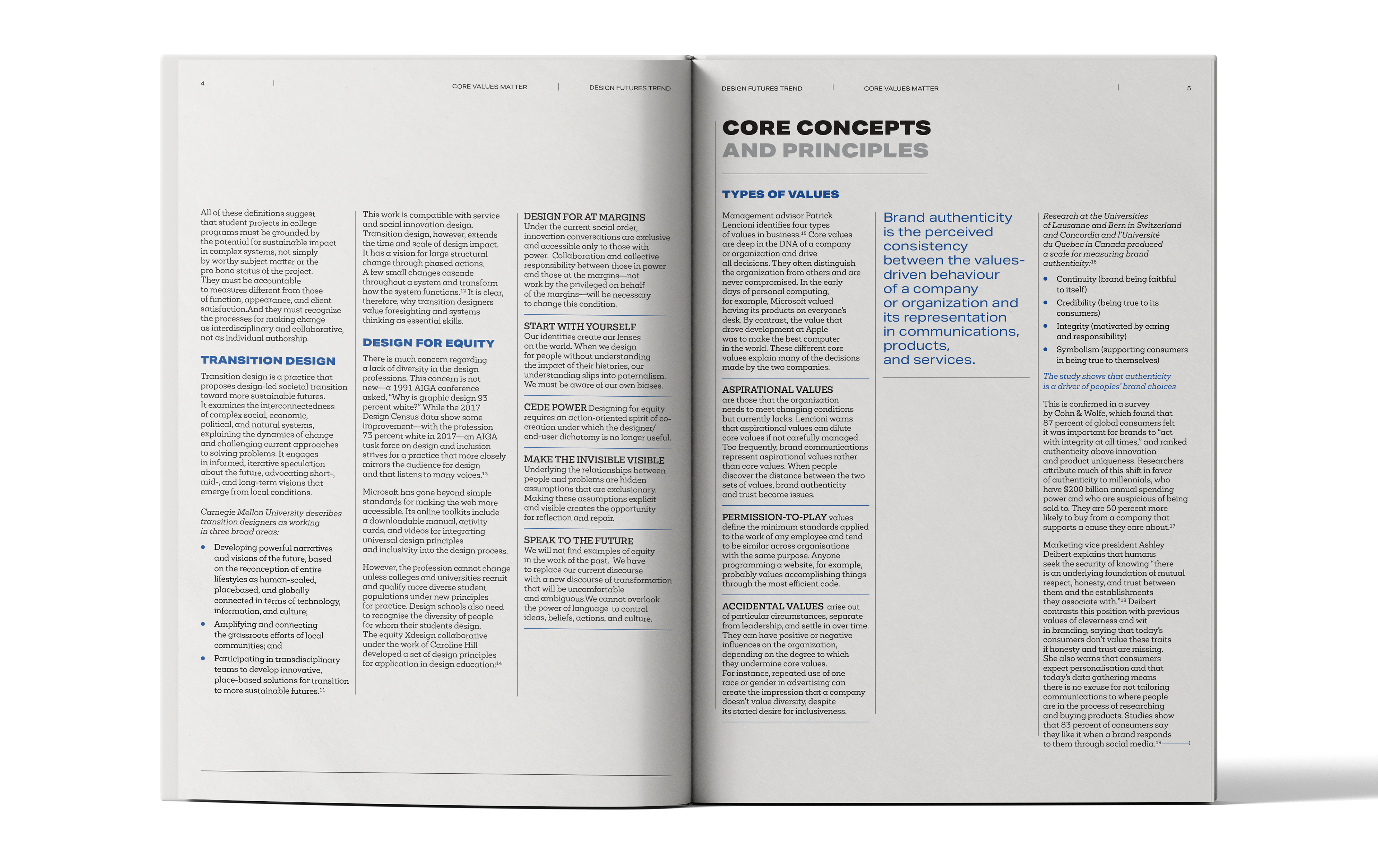
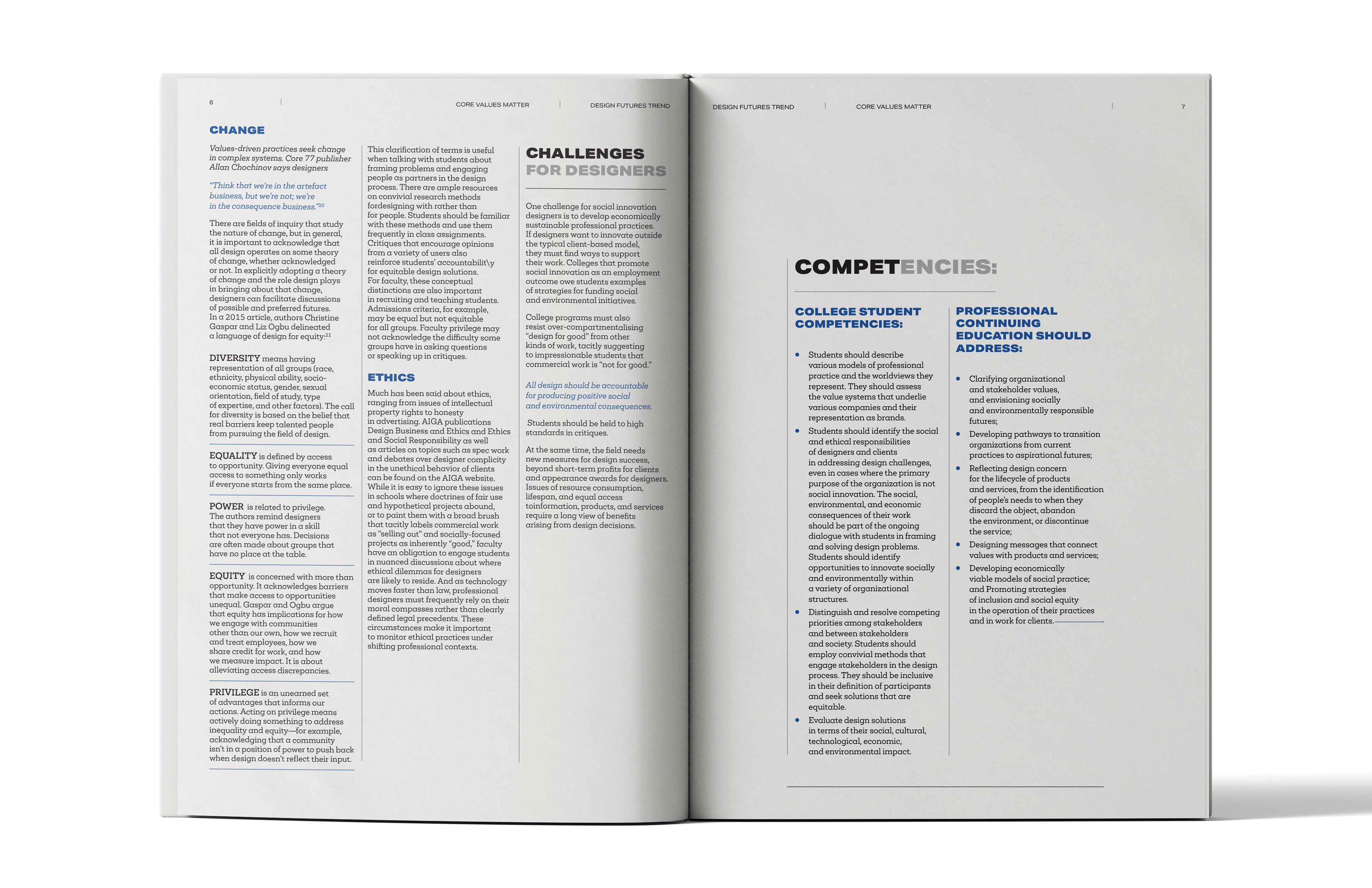
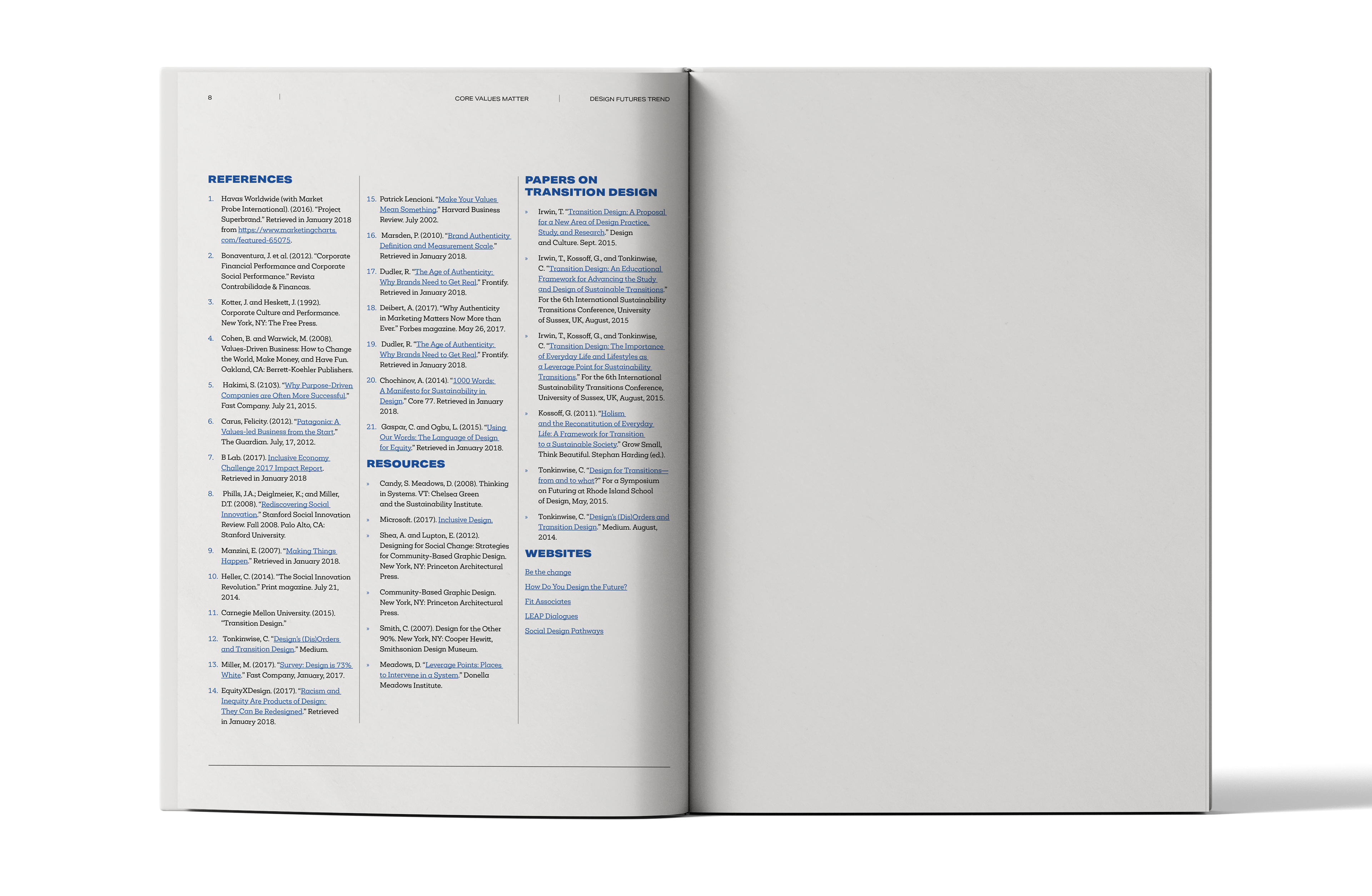
Ultimately, the applied typographical procedures, well-chosen column grid and skillful management of white space make the magazine both visually attractive and user-friendly in terms of content. Such a well-thought-out design effectively communicates key content, builds an impression of professionalism and motivates further reading and exploration of sources.